


All photography © Mulberry Media. Used with permission.
Mulberry Media
Brand Identity
Project Scope
Client: Mulberry Media
Industry: Photography, Videography
Services: Brand Identity, Logo Design
Time Frame: 4 Weeks
Table of Contents
1. Project Overview
The Concept
Mulberry Media is a photography and media company dedicated to capturing meaningful moments and turning them into lasting stories. Built on the values of connection, community, and authenticity, the brand aims to create a professional yet approachable experience for clients while supporting multiple photography specialties under a single unified identity.


The Challenge
Create a photography brand rooted in Jonathan's personal story while allowing the business to establish its own identity beyond him. The brand needed to support multiple photography specialties, reflect his atmospheric visual style, and provide a scalable identity system capable of growing alongside the business.


2. Discovery
Mulberry Media takes its name from the founder's surname, Morales, derived from the Spanish and Latin word for the mulberry tree. Historically associated with people who lived near these trees, it became the foundation for a modern, refined, and minimalist identity. The mulberry tree symbolizes strong roots, community, and growth.
Moodboard

Logo and Wordmark Sketches
Beginning with logo sketches, I explored ways to express the Mulberry name while reflecting Jonathan's distinctive style. We intentionally avoided cliché photography symbols like camera lenses or apertures, instead creating a mark as unique as his work. The concept balances the dark, moody atmosphere of his photography with Jonathan's charismatic personality, capturing the duality that defines his brand.
3. Logo Design
Although Jonathan initially wanted to avoid a literal tree-or-leaf logo, the rich history behind the name ultimately made those themes too meaningful to ignore. Rather than taking a traditional approach, I explored ways to reinterpret the symbolism of the mulberry tree as a modern, timeless identity. The tree became a symbol of growth, connection, and storytelling—qualities that aligned naturally with both the brand and Jonathan's work. As the concept evolved, Jonathan saw its potential, and together we refined it into something more atmospheric and mysterious in aesthetic.
With the icon being discussed, I also began sketching custom wordmarks that balanced elegance with a subtle edge, reflecting the moody, cinematic style of Jonathan's photography while complementing the refined simplicity of the mark.
Early Logo concepts

Option 1: Strong & Sharp
Strong wide typeface
Subtle edge to the typeface
Leaf Icon too soft and on the nose
Colorways too garden-inspired

Option 2: Growth & Iconic
Icon had potential
Boring typeface
too minimal
Icon too complex/not a tree

Option 3: Botuqie & Edgey
Did not feel unique enough
Felt very home garden brand
No strong icon direction
Final Logo design
Jonathan was drawn to the timeless, refined character of the wordmark in Option 1, while also seeing the potential in the icon from Option 2. He challenged me to evolve the icon into something that subtly suggested a tree without feeling literal. Our goal wasn't to create an obvious tree symbol, but an emblem that felt modern, mysterious, and beautifully understated.
Icon Exploration





Logo Breakdown
Mulberry Tree Icon — A modern interpretation of the mulberry tree symbolizing growth, connection, and storytelling, with a subtle "M" hidden in the trunk representing both Morales and Mulberry Media.
Branch Structure — Clean, symmetrical branches represent multiple creative paths united under one brand, reflecting Mulberry Media's diverse photography services.
Custom Wordmark — Elegant letterforms with sharp details balance sophistication with a subtle edge, inspired by Jonathan's dark, cinematic photography style.
Circular Emblem — Creates a timeless, versatile mark that works across digital and print applications while subtly evoking focus without relying on photography clichés.


Mulberry Branches
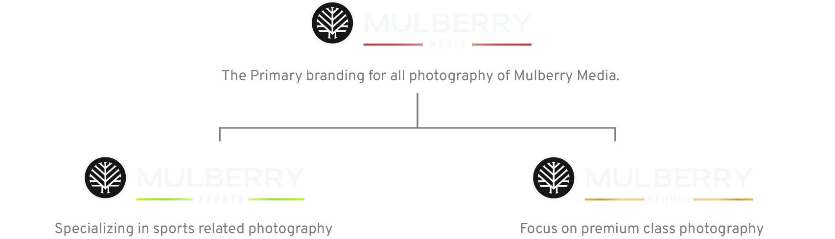
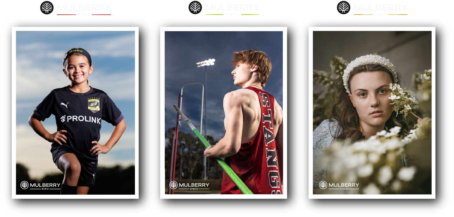
The primary logo was designed with three distinct taglines and color palettes to organize the brand across Mulberry Media's three core service offerings while allowing room for future growth.
Media: The overall brand and total offering of Mulberry Media.
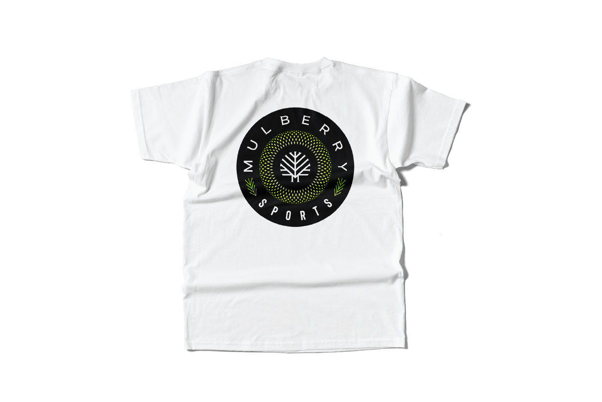
Sports: Photography centered on high school, collegiate, and professional sports. This serves as the starting point for Mulberry Media’s services.
Studios: Premium photography sessions for professional headshots, senior portraits, or family photos.












4. Identity System

Mission Statement
At Mulberry Media, we’re passionate about capturing life’s most meaningful moments through photography and media. Inspired by the strength and beauty of the mulberry tree, our mission is to help individuals and communities preserve their stories — from everyday joy to once-in-a-lifetime milestones.
Rooted in creativity and connection, we turn memories into lasting images that evoke emotion, curiosity, and a sense of belonging. Like the branches of our logo, we reach out to grow with you — one story, one photo, one memory at a time.
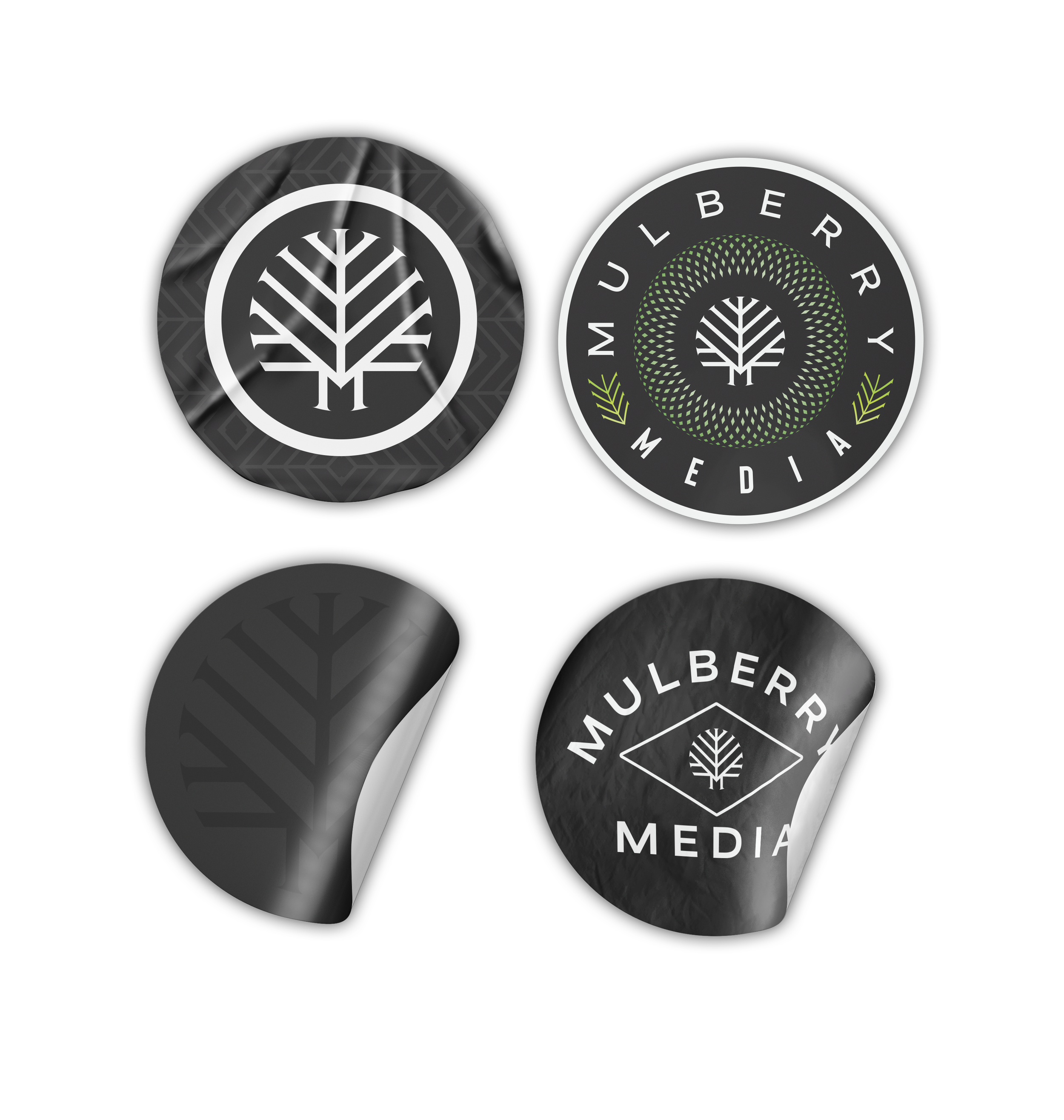
Crest & Badge Designs








Pattern Design
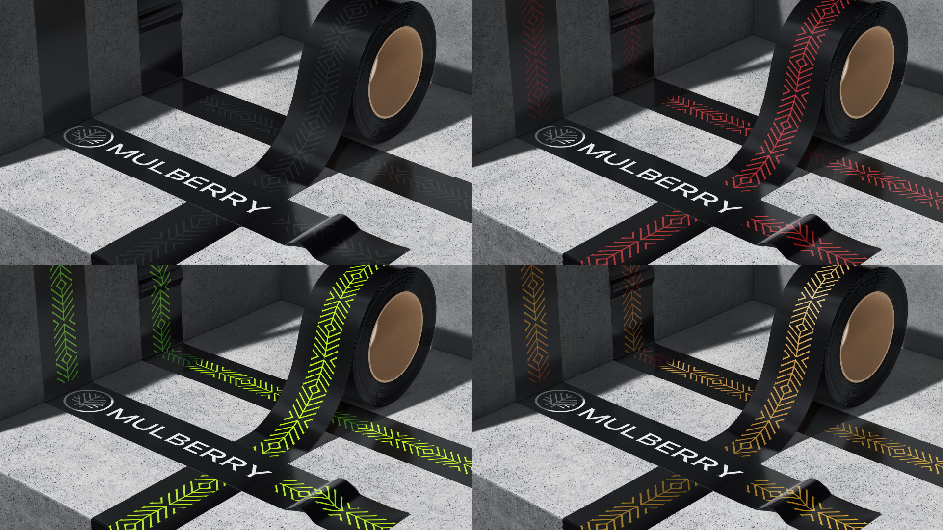
The pattern was designed to evoke a sharp, atmospheric sense of mystery while reinforcing the brand's identity. Intended for applications such as photography booth boundary tape and branded merchandise, it needed to be both bold enough to capture attention and versatile enough to function as a subtle texture across a variety of materials. The interconnected lines are inspired by the branching structure of a mulberry tree, symbolizing connection and growth throughout the brand system.





Proper Pattern Usage
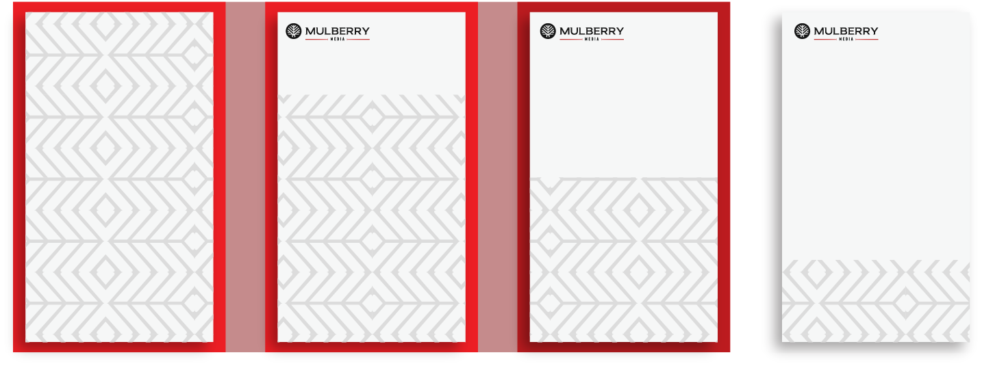
The areas highlighted in red show incorrect usage of the floral pattern. In these examples, the pattern exceeds the allowed 1/4 of the total surface area and is against the suggested design guidelines.
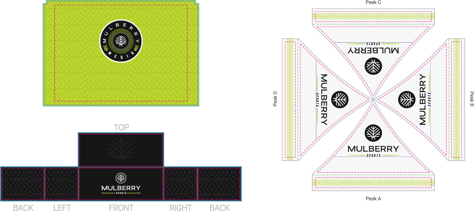
Pattern & Branding Usage Examples
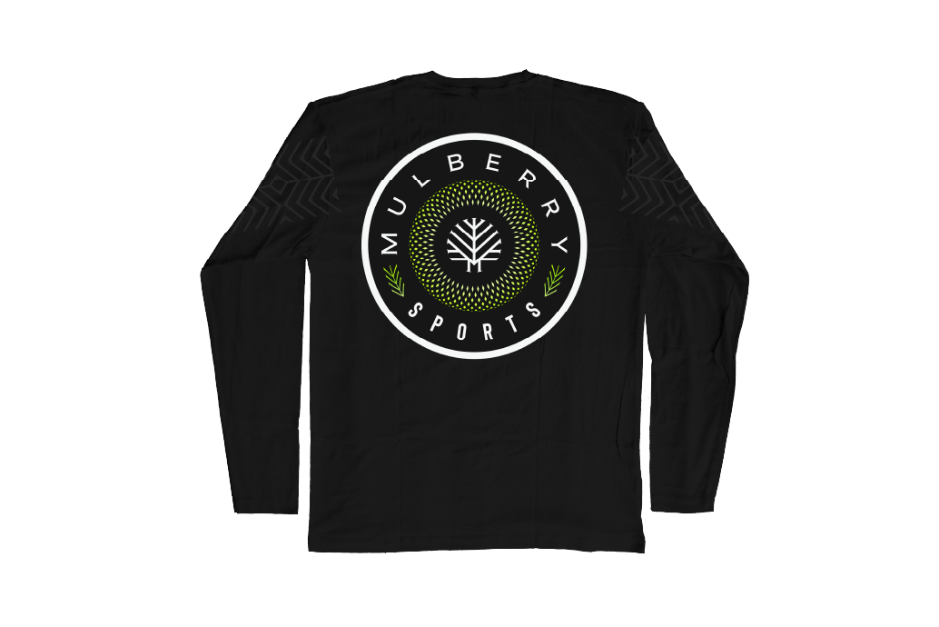
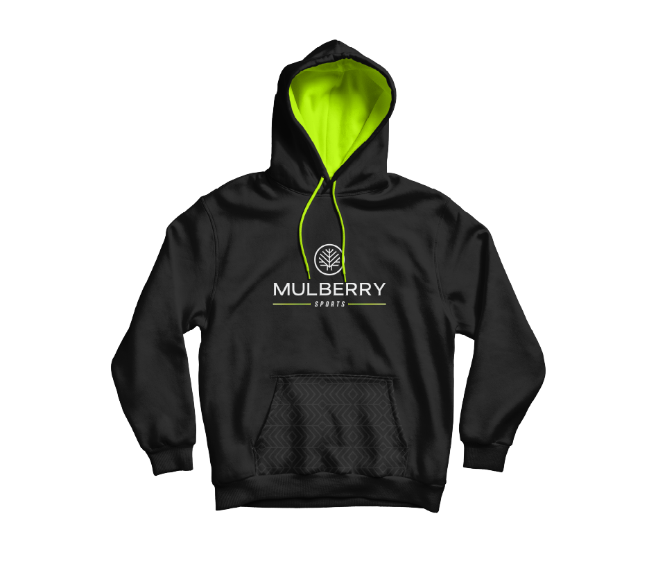
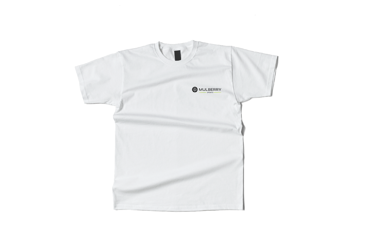
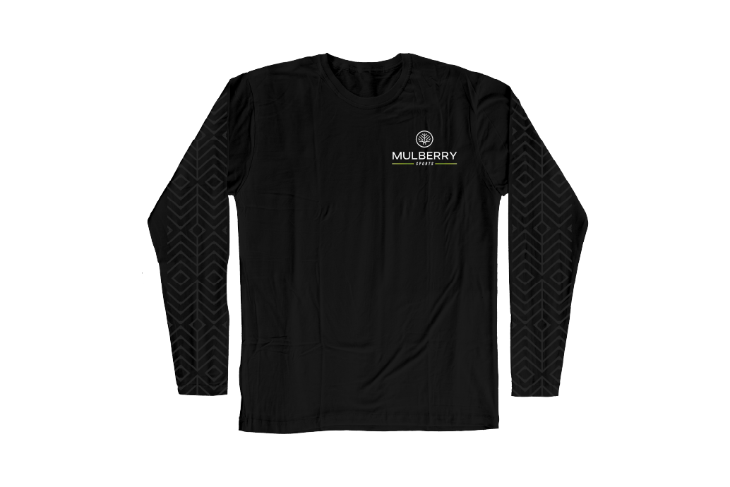
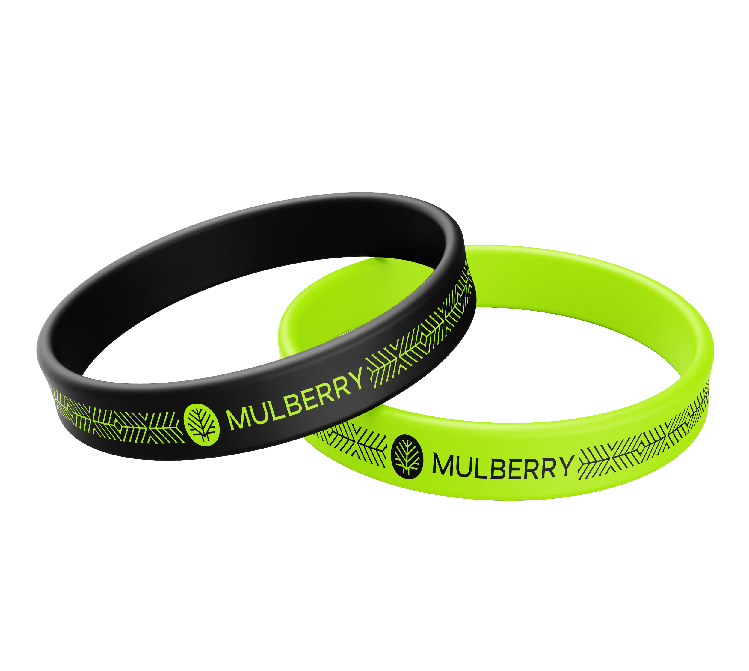
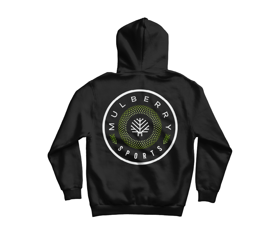
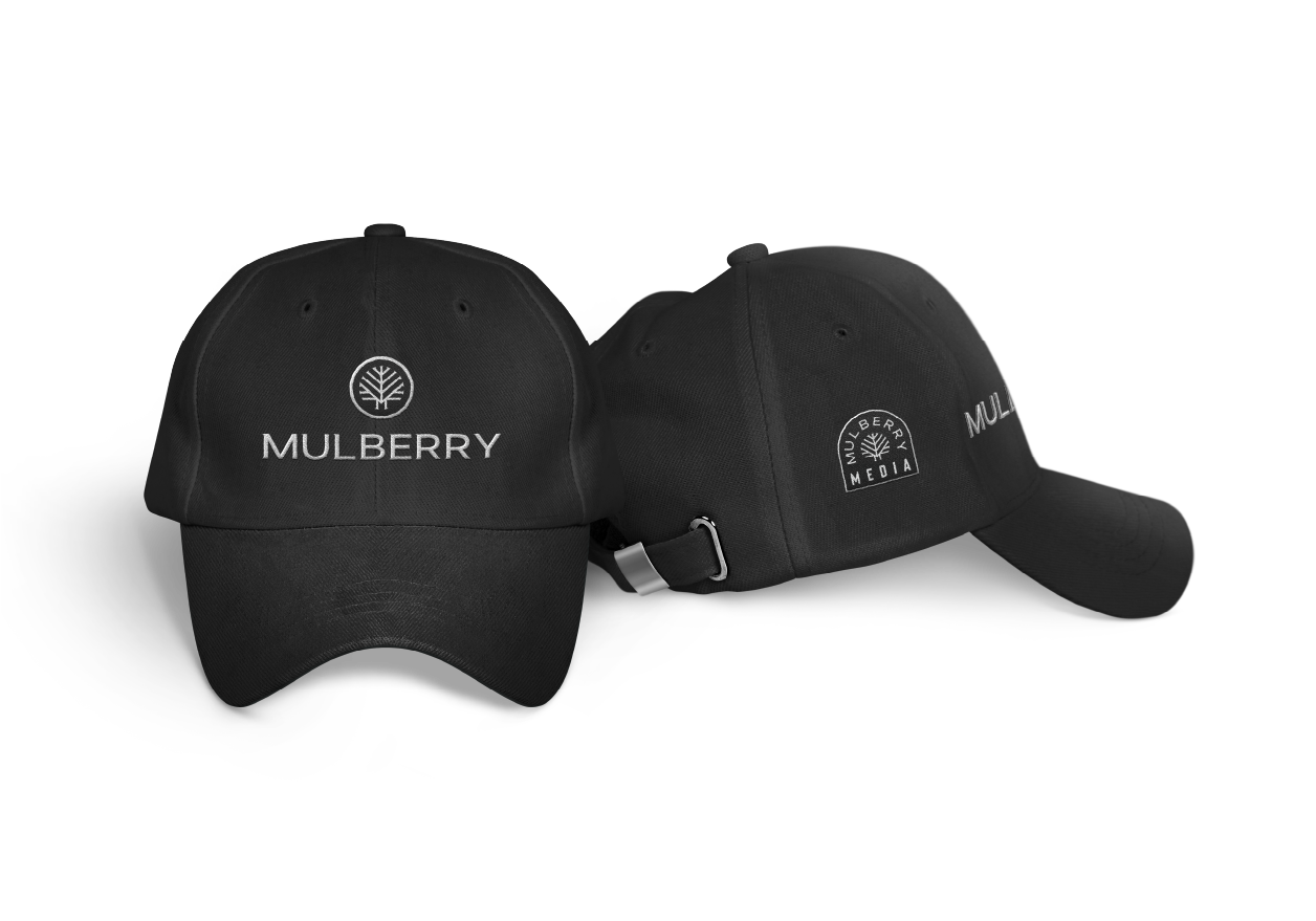
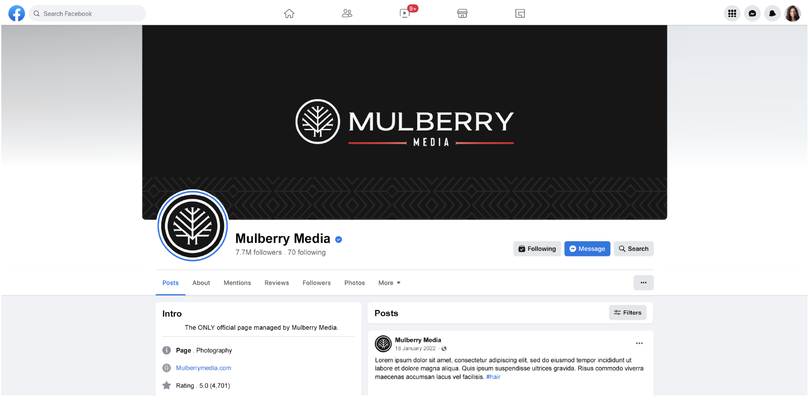
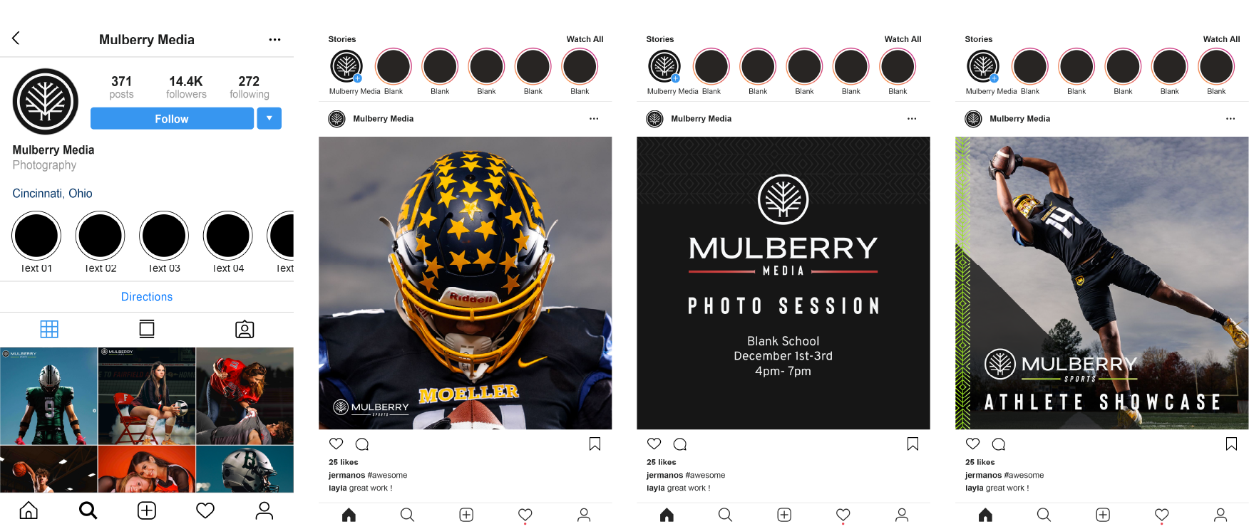
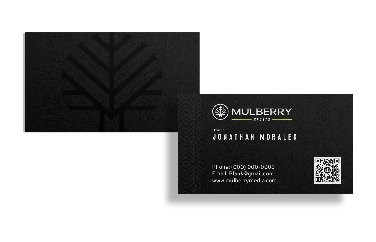
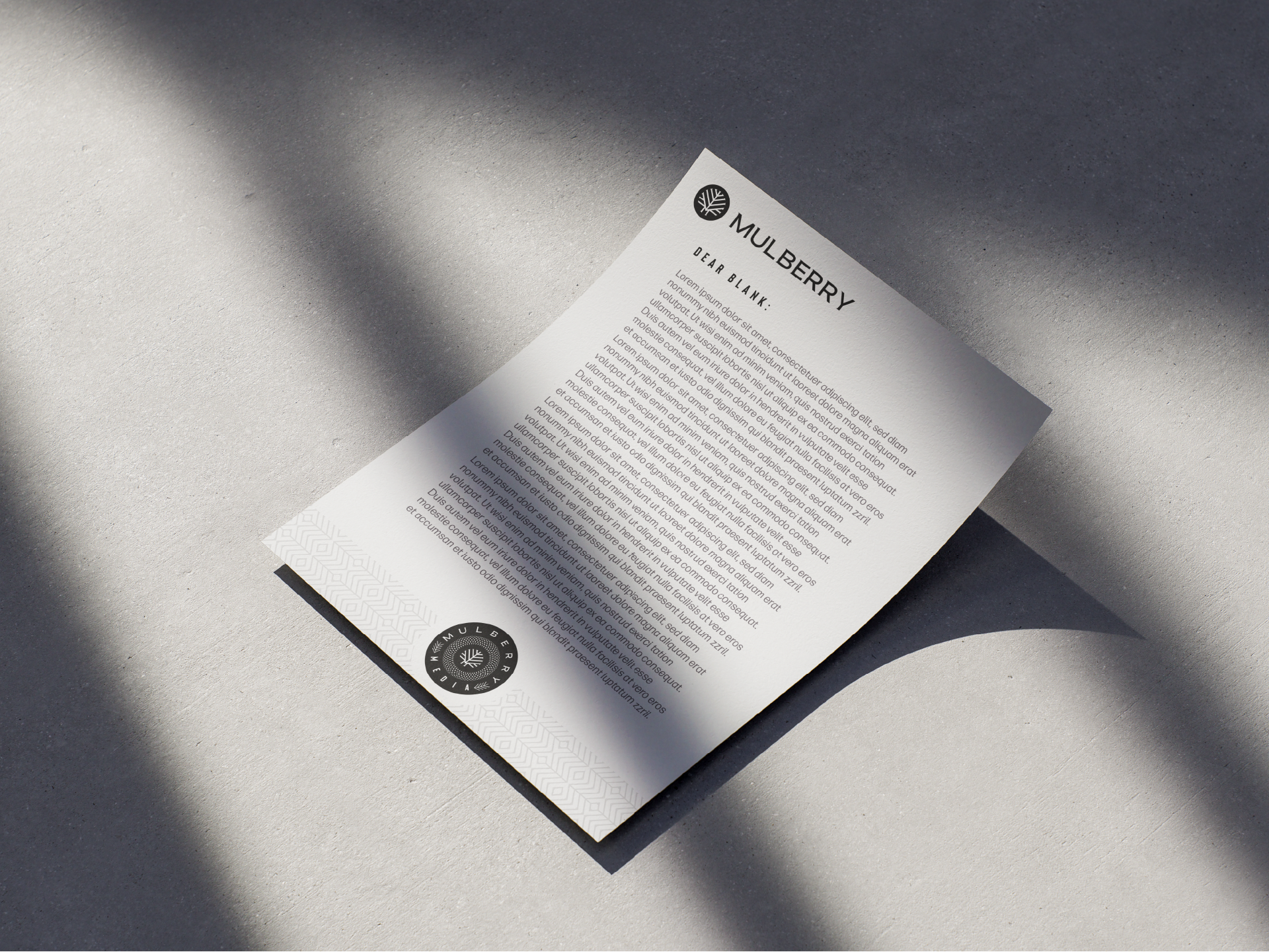
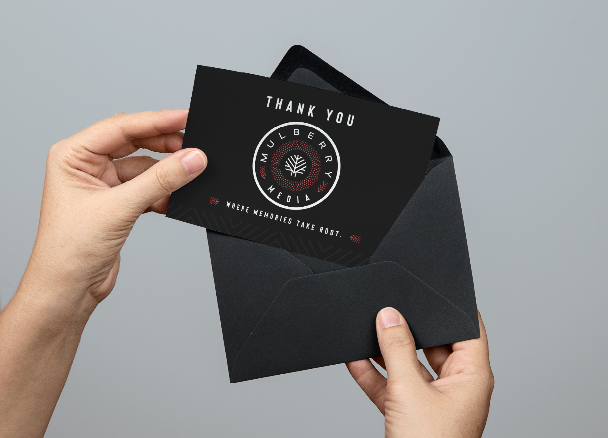
Below is an example of how we used the brand assets and patterns on assets for Mulberry Media.
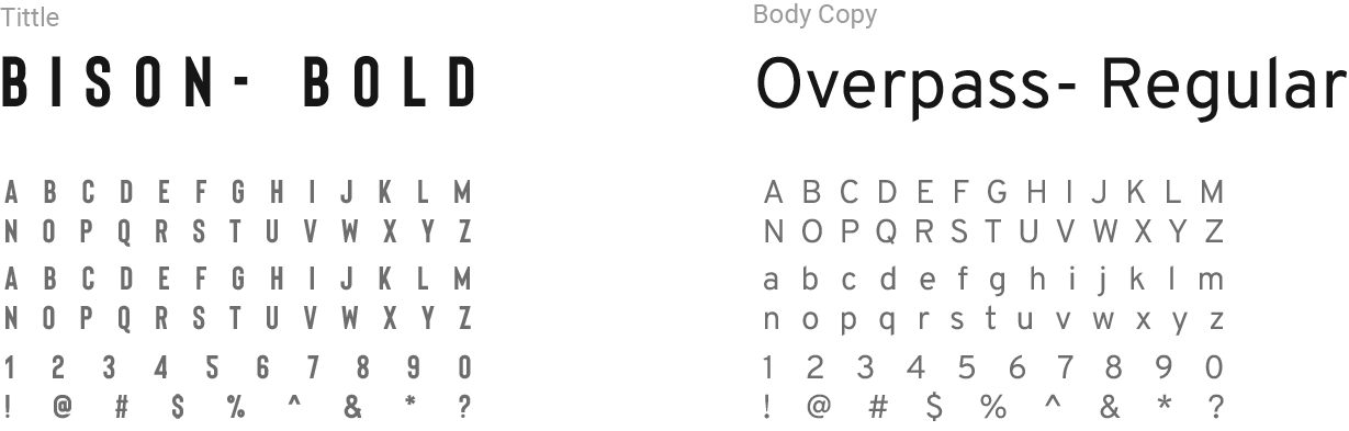
Typefaces
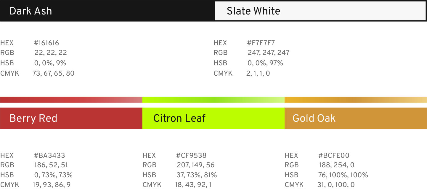
Color Layout
The colors selected for Mulberry Media are inspired by the expressive tones found in a mulberry tree, aligning with the brand's name. Each color also represents the distinct branches of the company, such as Mulberry Sports and Mulberry Studio.
Dark Ash and Slate White are sharp, neutral tones that allow the brand to present content without visual distraction or color conflict.
Berry Red serves as the primary brand color—symbolizing the fruit of Mulberry Media’s labor.
Citron Leaf brings an energetic feel while intentionally avoiding common sports team colors like red or blue, helping Mulberry Sports stand out.
Gold Oak is an elegant choice designed to evoke a sense of premium quality and craftsmanship, reflecting the high standards of the Mulberry Studio branch.

5. Brand in Use



"Working with Clayton defines professionalism. From our first call, I knew he was a professional. The questions he asked and the way he guided me through the process made creating my brand seamless.
In my experience, working with Clayton is essential for serious business growth."
Jonathan- Owner of Mulberry Media