

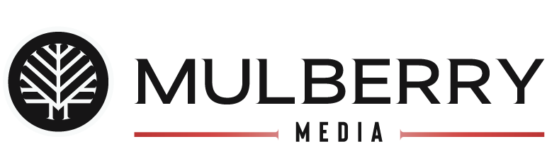
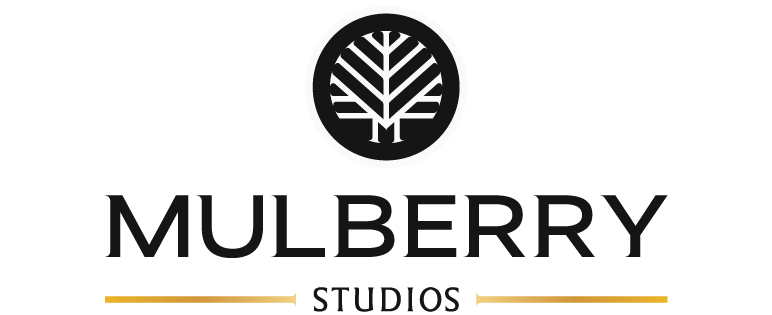
Brand Photography: Mulberry Media
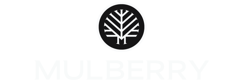
Mulberry Media
Brand Identity
Project Scope
Client: Mulberry Media
Industry: Photography, Videography
Services: Brand Identity, Logo Design
Time Frame: 4 Weeks
Table of Contents
1.Project Overview
The Concept
Mulberry Media is a photography and media company dedicated to capturing meaningful moments and turning them into lasting stories. Built on the values of connection, community, and authenticity, the brand aims to create a professional yet approachable experience for clients while supporting multiple photography specialties under a single unified identity.

The Challenge
Create a photography brand rooted in Jonathan's personal story while allowing the business to establish its own identity beyond him. The brand needed to support multiple photography specialties, reflect his atmospheric visual style, and provide a scalable identity system capable of growing alongside the business.

The story behind Mulberry Media began with the founder's surname, Morales, which derives from the Spanish and Latin word for the mulberry tree. Historically, the name was associated with people who lived near or were connected to these trees.
Through word mapping and mood board exploration, the brand direction emerged as modern, refined, minimalist, and atmospheric. The mulberry tree became a natural foundation for the identity, symbolizing strong roots, community, and growth.

2.Discovery
Moodboard
Logo and Wordmark Sketches
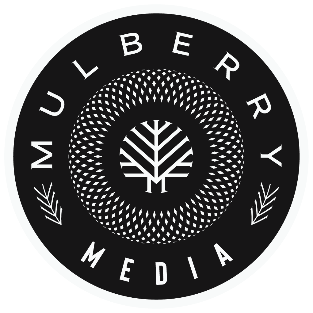
Starting with the logo design sketches, I wanted to capture the symbolism of the Mulberry name and pull ideas from the unique qualities of Jonathan’s work to incorporate them into a standout brand icon. We avoided cliché photography imagery like apertures or camera lenses; we wanted to stand out from the crowd since Jonathan’s work was unlike many I have seen in the photography world. Dark, moody, with edge, but also Jonathan is a charismatic and bubbly personality. The duality of his work and personality really led my decision process while sketching designs for review.
3.Logo Design
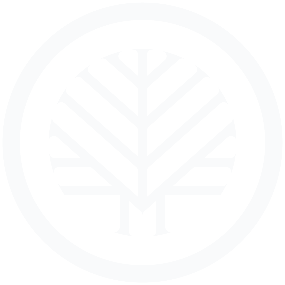
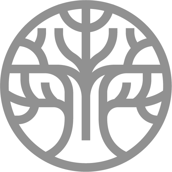
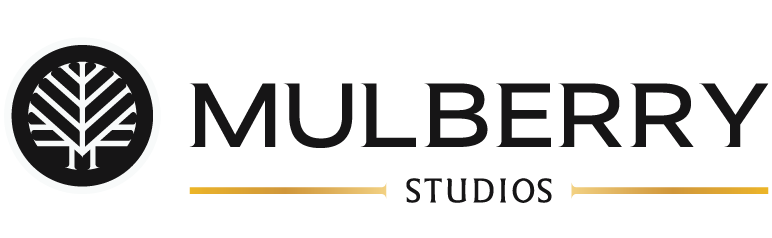
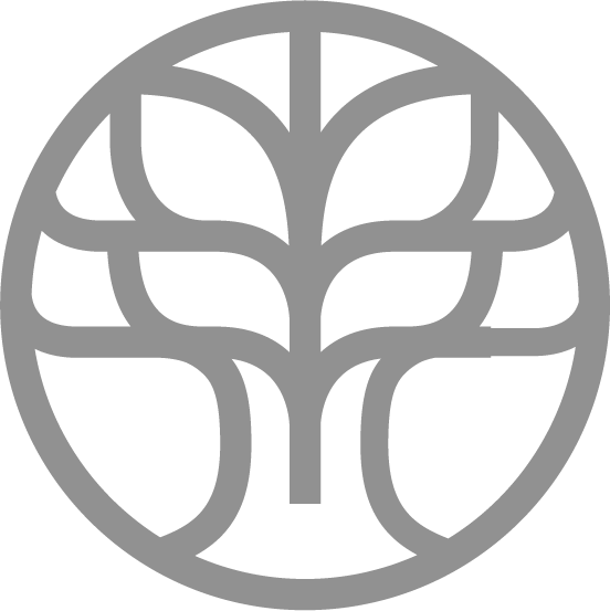
Although Jonathan initially wanted to avoid a literal tree-or-leaf logo, the rich history behind the name ultimately made those themes too meaningful to ignore. Rather than taking a traditional approach, I explored ways to reinterpret the symbolism of the mulberry tree as a modern, timeless identity. The tree became a symbol of growth, connection, and storytelling—qualities that aligned naturally with both the brand and Jonathan's work. As the concept evolved, Jonathan saw its potential, and together we refined it into something more atmospheric and mysterious in aesthetic.
With the icon being discussed, I also began sketching custom wordmarks that balanced elegance with a subtle edge, reflecting the moody, cinematic style of Jonathan's photography while complementing the refined simplicity of the mark.
Early Logo concepts
Option 1: Strong & Sharp
Strong wide typeface
Subtle edge to the typeface
Leaf Icon too soft and on the nose
Colorways too garden-inspired
Option 2: Growth & Iconic
Icon had potential
Boring typeface
too minimal
Icon too complex/ Not a tree
Jonathan really loved the timeless edge to the word mark in
option 1, but also loved the idea of the icon from option 2 if I could make it look more like a tree, but subtly. We didn’t want just a big tree icon, but something that felt edgy and simply beautiful. So, the final logo design is the combination of those elements.
Final Logo design

Option 3: Botuqie & Edgey
Did not feel unique enough
Felt very home garden brand
No strong icon direction
Icon Exploration


Logo Breakdown
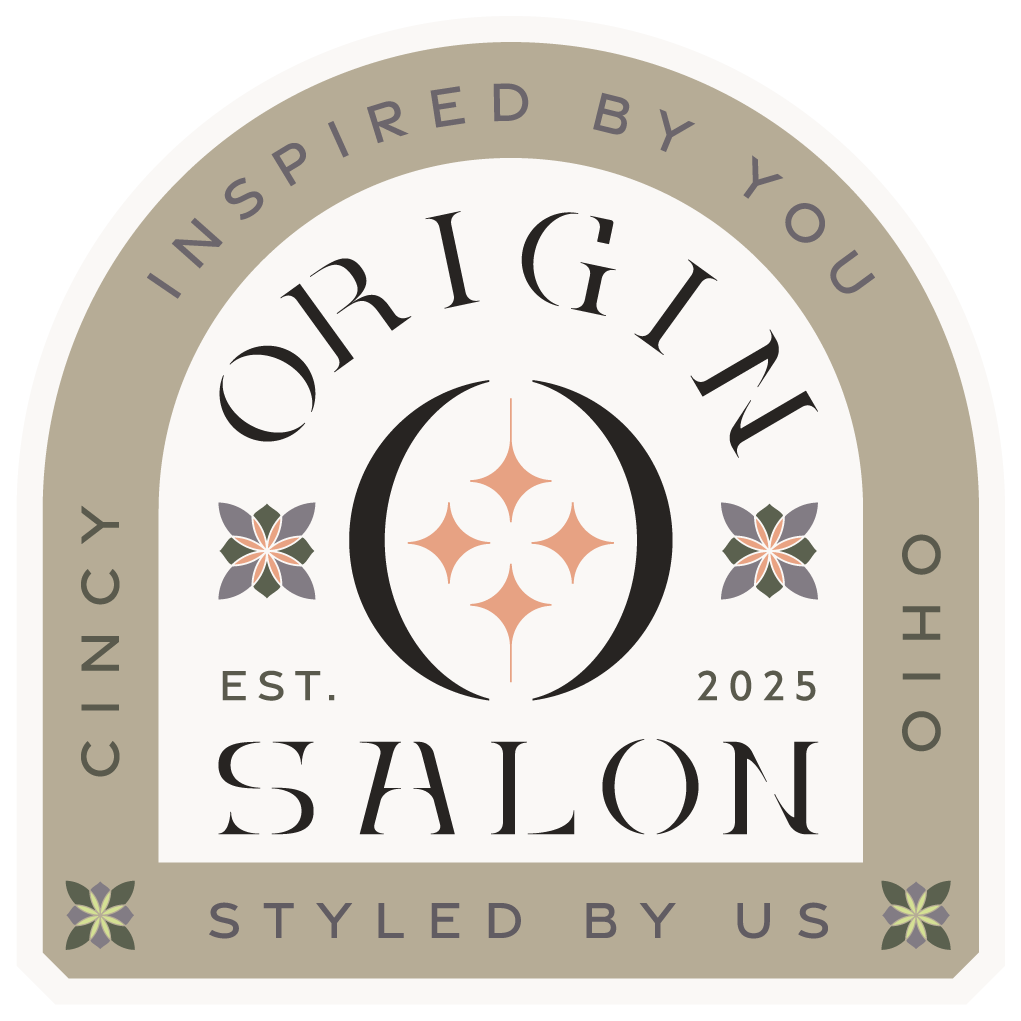
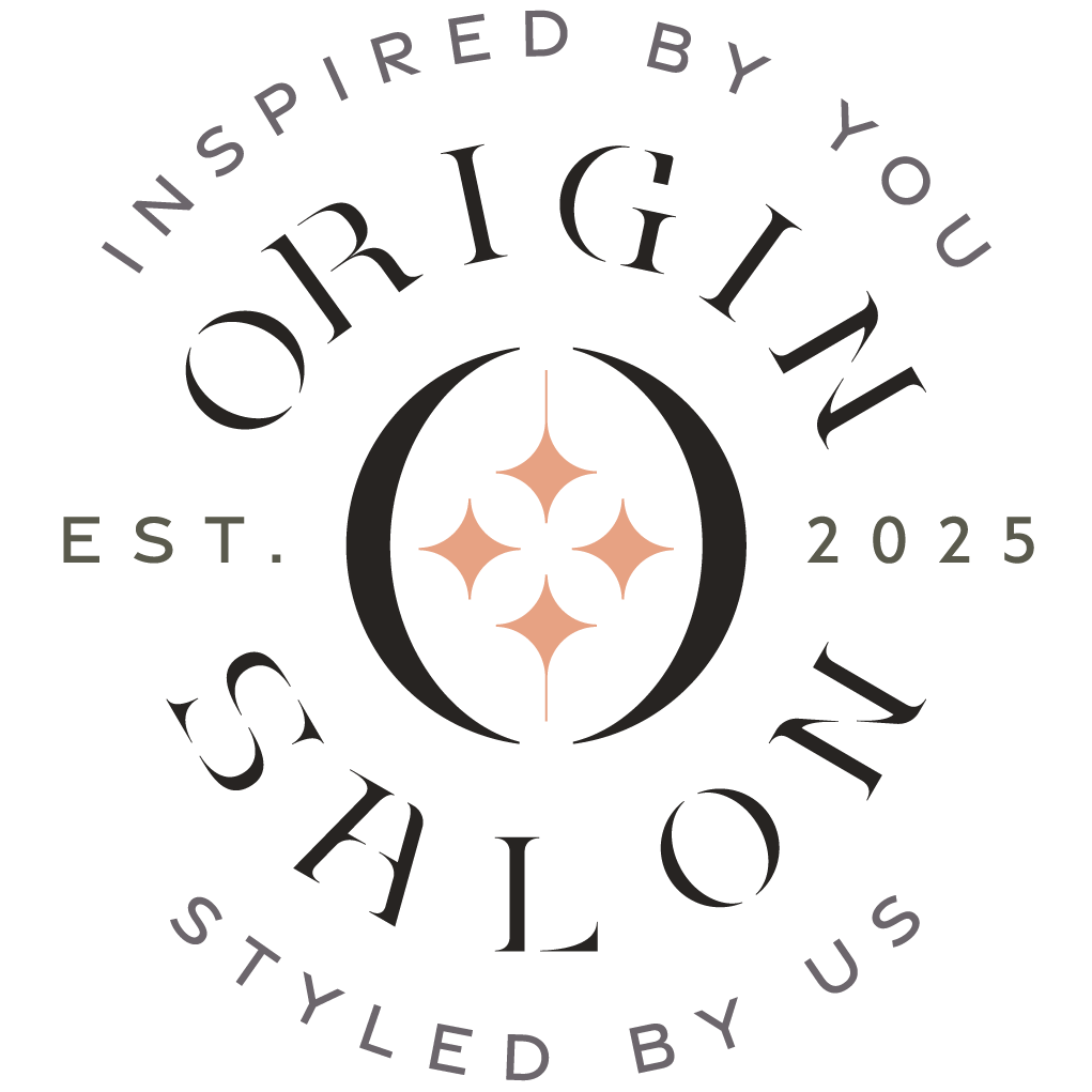
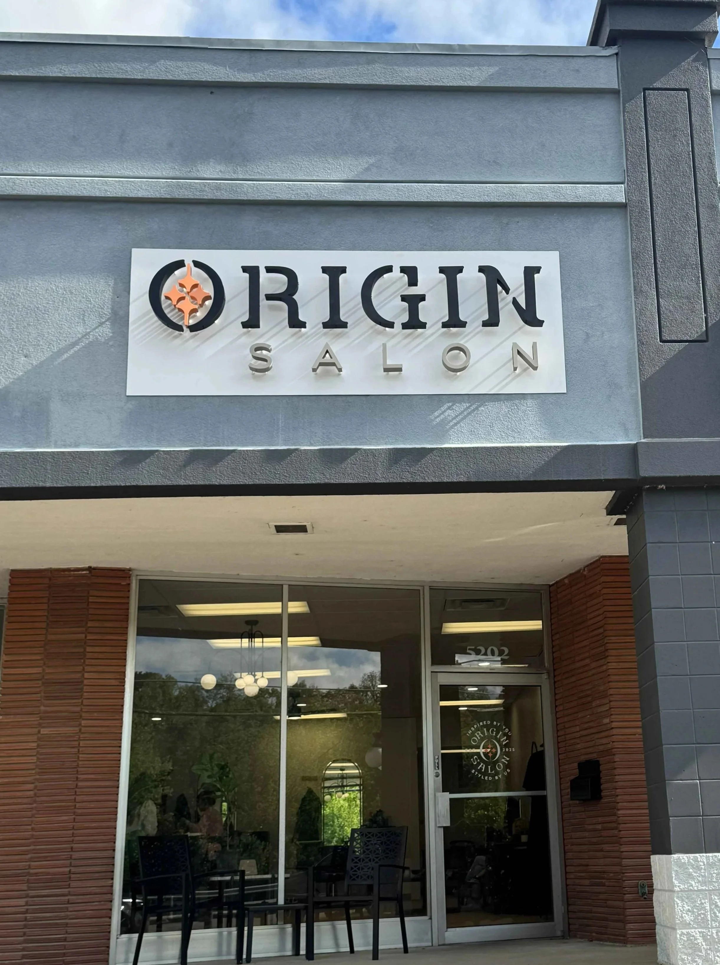
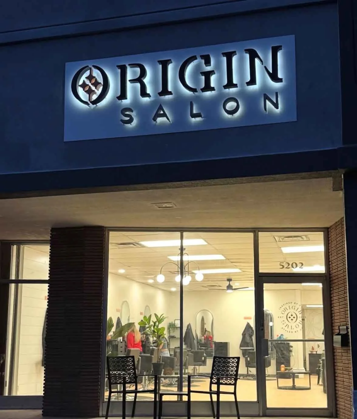
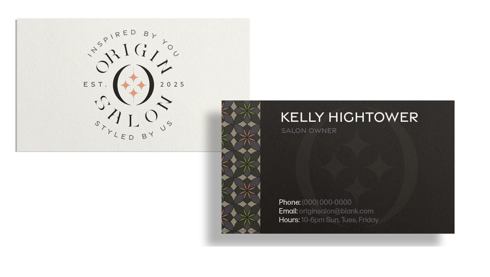
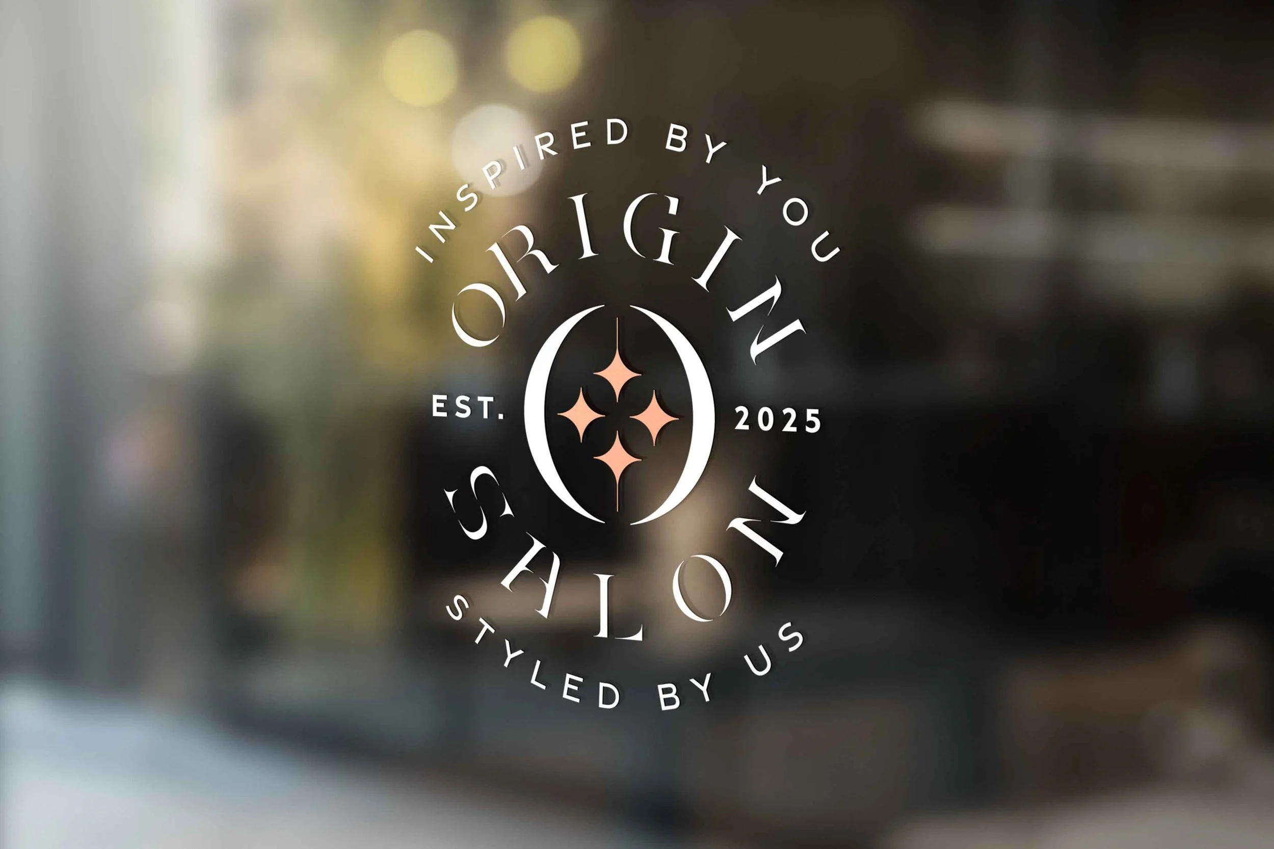
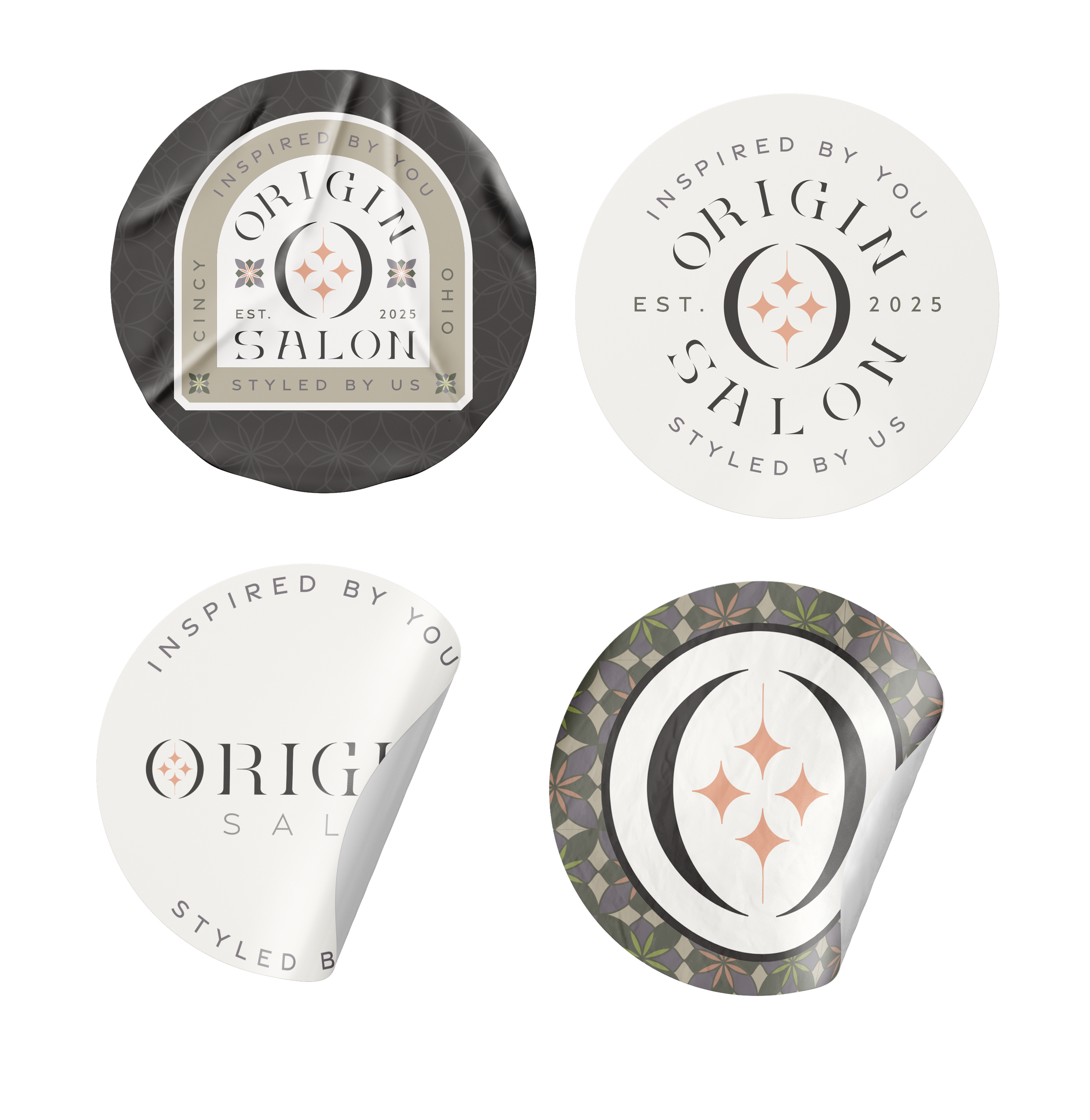
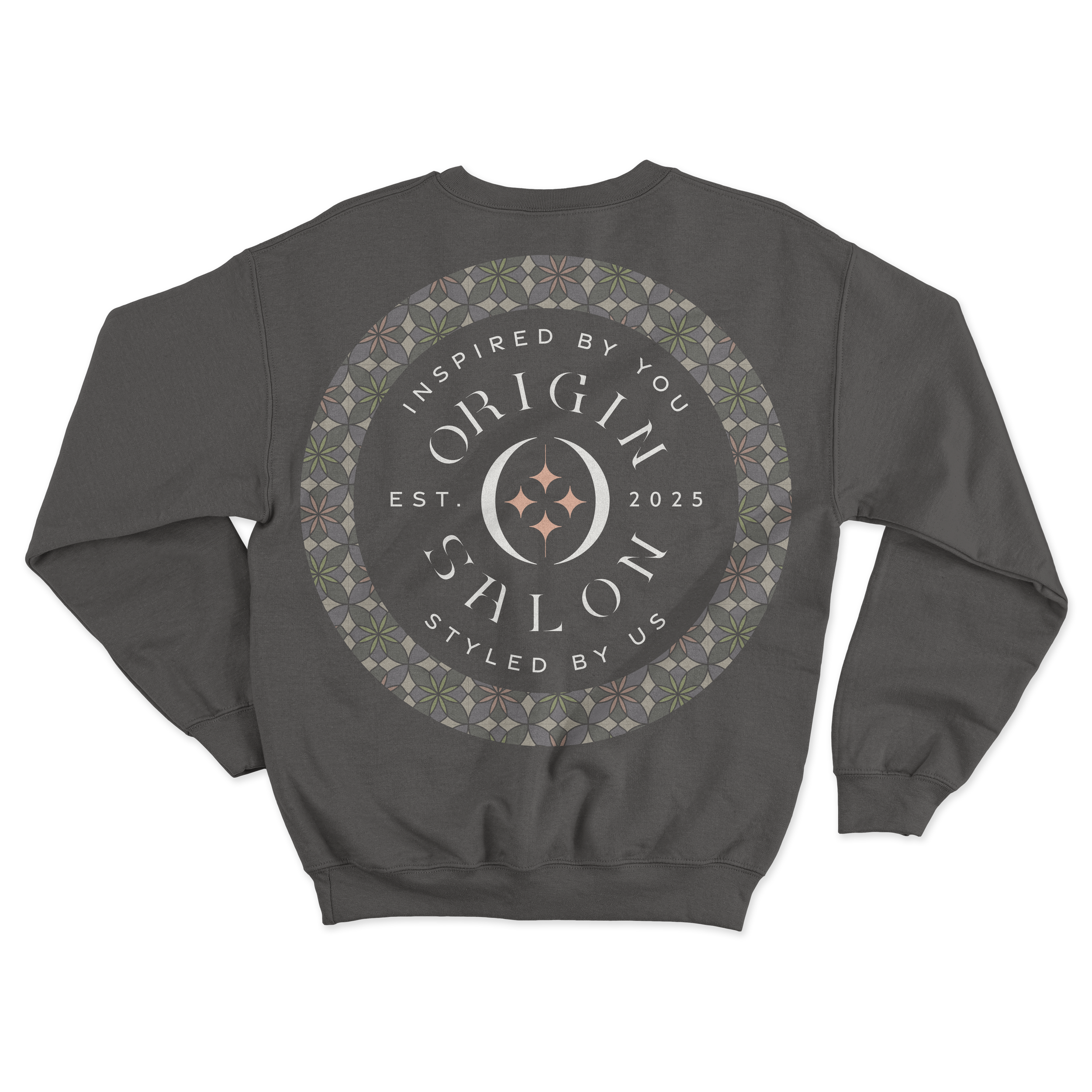
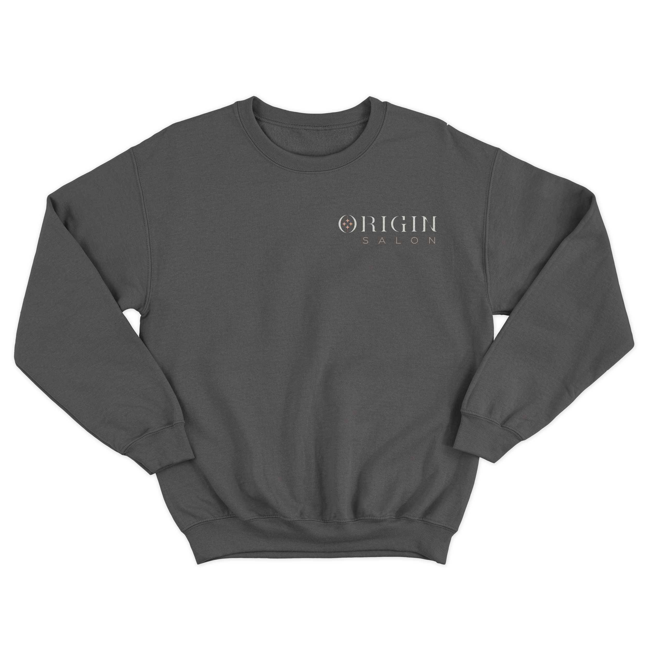
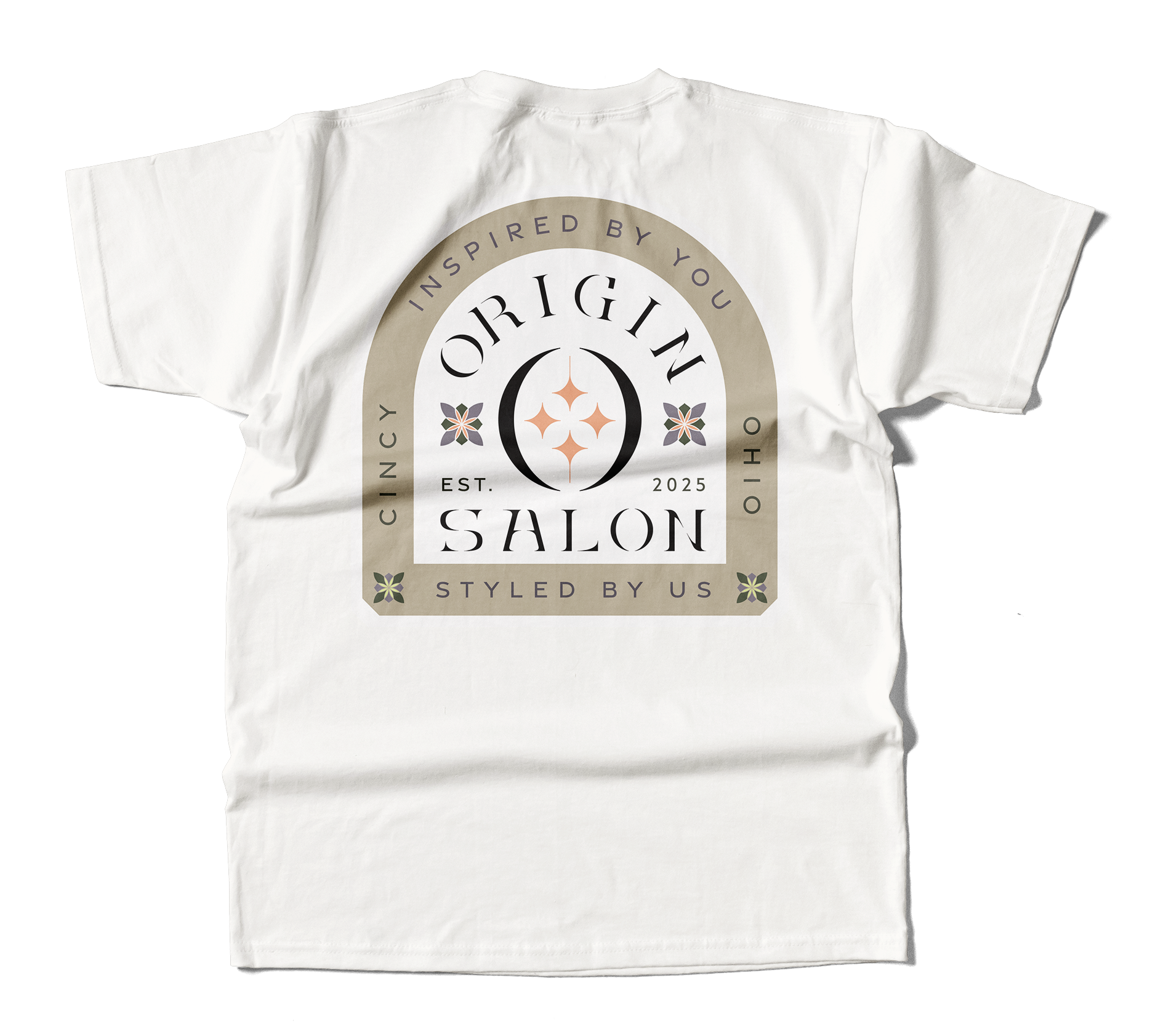
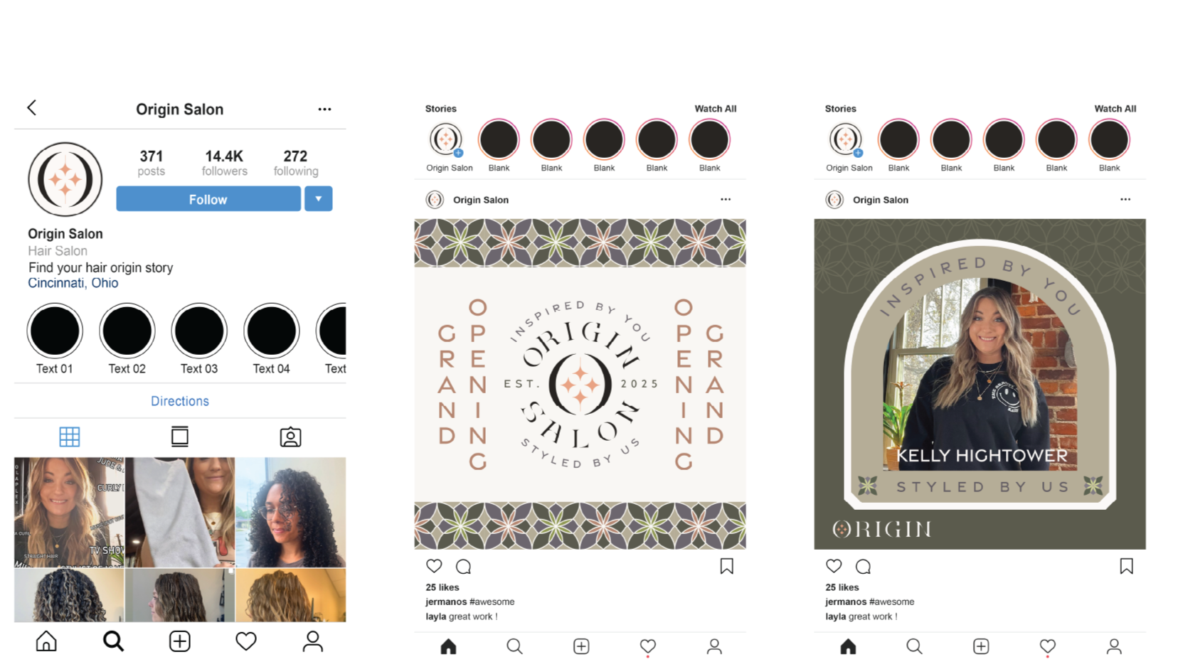
The four stars centered within the “O” of Origin Salon symbolize the concept of beginnings — the origin itself. Together, the stars form a negative space flower, representing the blossoming of a beautiful origin story.
On a personal level, the stars hold deep meaning for the owner, Kelly Hightower. Each one represents a member of her immediate family: her husband, her son, her daughter, and herself. This is her origin story.
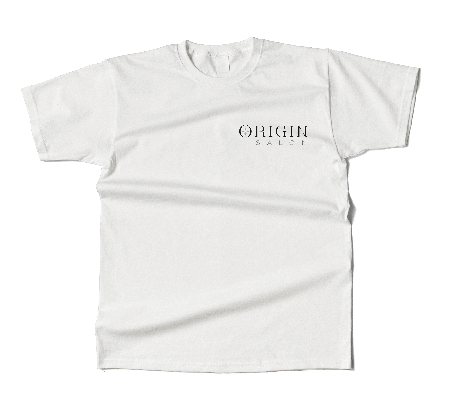
The primary logo is a wordmark crafted from a custom typeface. The design goal was to evoke a modern, clean, and strong aesthetic, while also capturing a sense of elegance and ethereal beauty.
The structured serifs lend each letter a bold, grounded presence, while the subtle gaps within the letterforms introduce a soft, airy, almost spectral quality — creating a balanced blend of strength and delicacy.
4.Identity System
Mission Statement
At Origin Salon, our mission is to provide a relaxing, healthy, and high-quality hair care experience that honors each person's unique story.
We believe that true self-expression is personal and comes from within. Our goal is to help every client feel refreshed, confident, and authentically themselves. Through thoughtful, individualized styling—not trends or gimmicks—we aim to highlight what makes you unique so your Origin story can shine.
Pattern Design
Origin Salon was born from my wife's longtime dream of opening her own salon. When that dream became reality, she partnered with me to create a brand identity that reflected her vision and values.
At its core, the brand celebrates authenticity—enhancing natural beauty rather than changing it. This philosophy became the foundation of the identity and inspired the slogan: "Inspired by you, styled by us."
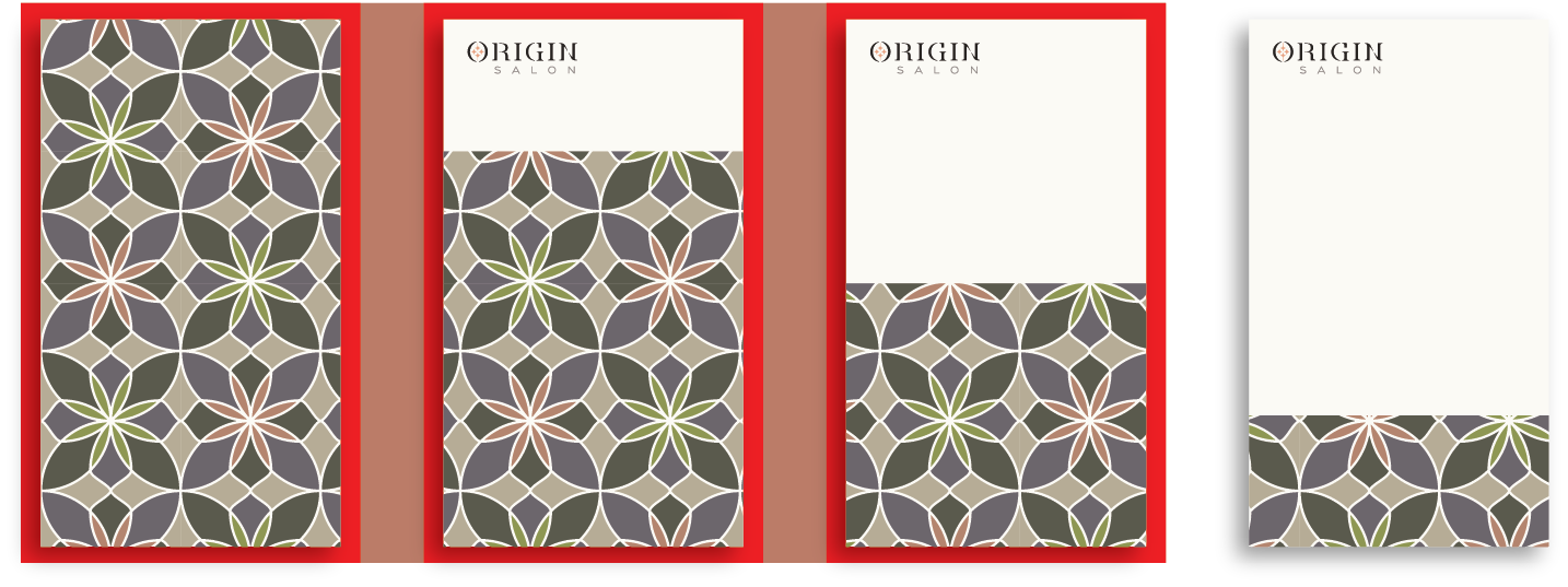
Proper Pattern Usage
The areas highlighted in red show incorrect usage of the floral pattern. In these examples, the pattern exceeds the allowed 1/4 of the total surface area and is against the suggested design guidelines.
Crest Designs
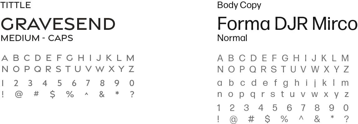
Typeface
Color Layout
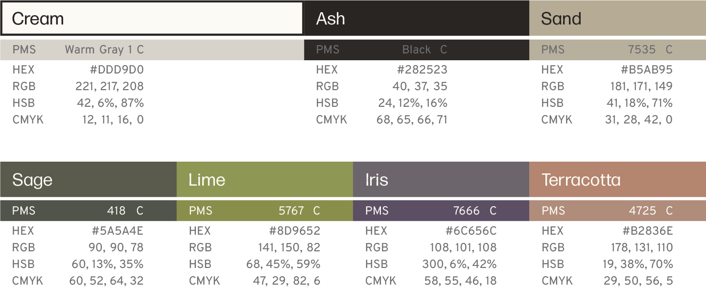
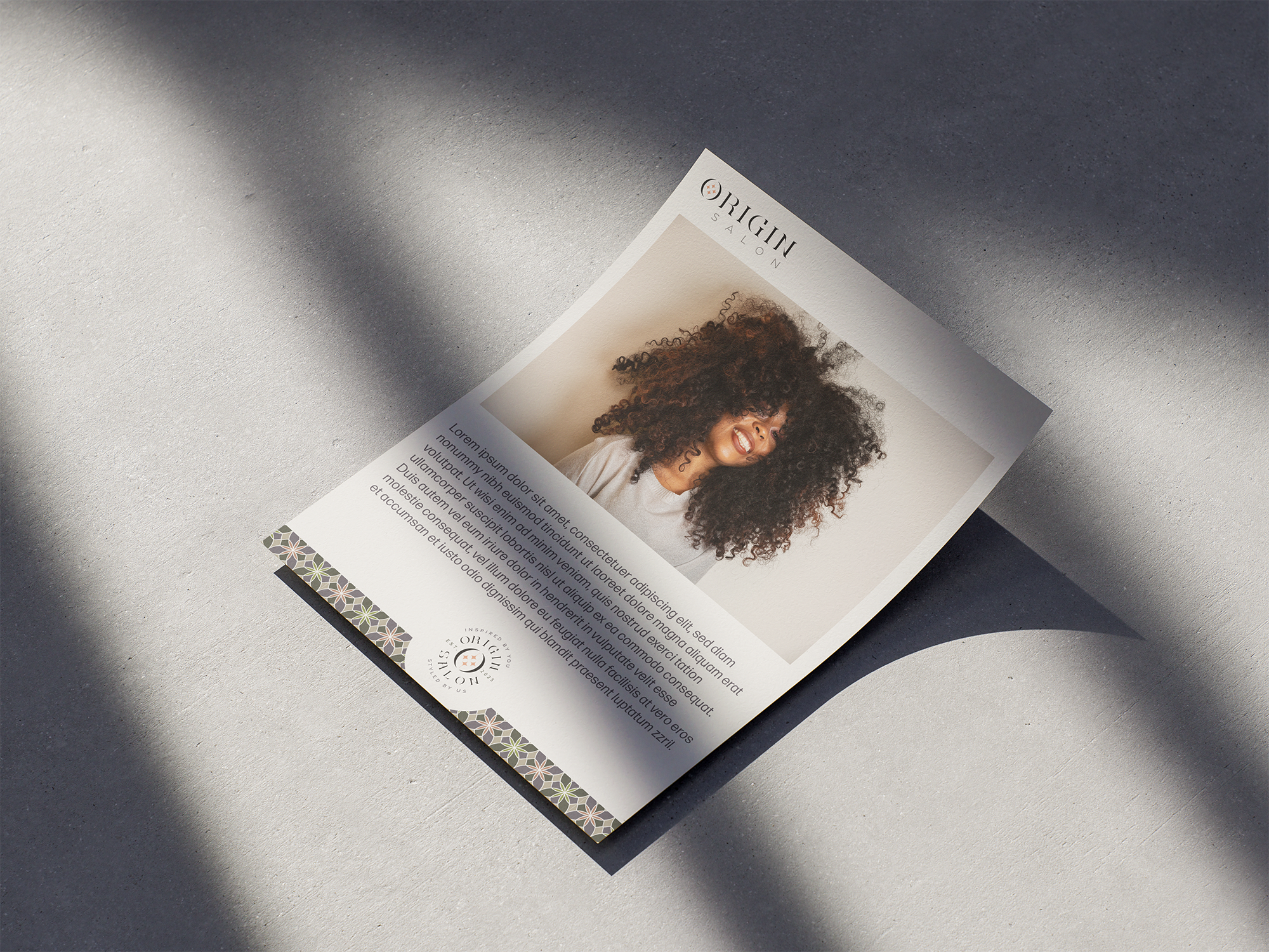
Origin Salon celebrates natural beauty and self-expression, which inspired a palette of earthy neutrals accented by subtle botanical tones. The colors were carefully chosen to feel both refined and welcoming, creating an identity that is inclusive, balanced, and appealing to a diverse range of clients and stylists.
5.Brand in Use


“Clayton was so easy to work with; he really made my brand come to life. I’ve shown co-workers my new branding, and they say it fits me so well, and I couldn’t have done it without Clayton’s vision.
Kelly Hightower - Cosmetologist